15 interesting logos of all time !
Its amazing how you can wrap up the vision of a billion dollar company into a small pattern or a picture and let it do the talking. That is the power of logo. This is exactly why you give atmost importance while you transform your conception into a LOGO. A good logo design is not just a visual representation of a business. It actually describes stories, ideas and the vision of that particular business. It can convey emotions, fascinate the viewers and even manipulate them into doing things. These logos tell you stories and today we are sharing with you 15 such fascinating story which is hidden behind world famous logos.
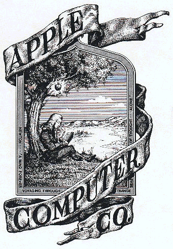
1. Apple’s Logo
Apple Inc is one of the largest companies in the world and the most valuable technology company in the world, having surpassed Microsoft.The company has undergone many changes since its beginning and so has its logo.
The first Apple logo was designed in 1976 by Ronald Wayne, who sometimes refered to as the one of the founders of the company.The logo had Newton sitting under the tree.The phrase on the outside border reads, “Newton… A Mind Forever Voyaging Through Strange Seas of Thought … Alone.”
![]()
Eventually this logo didnt last a year long. A graphic designer Rob Janoff was assigned with the job to design a new modern logo for the company. It was then the famous iconic logo “The rainbow logo”, which represented the company for more 22 years, produced ![]()
In 1997, when Steven jobs came back to the company, he was stuck with idea of using the logo for company’s advantage. He wanted to place the logo for the world to see it. But placing the rainbow logo in the products looked silly and out of place. In 1998, arrived the Monochrome styled logos which was place in all their products. The logo also helped in revolutionizing the company’s attitude in making new range of creative products. It took the company from the verge of failure to the most valuable technology company in the world.
![]()
2. Amazon’s Logo
![]()
Amazon first logo didnt contain much meaning when it first appeared in 1998. Soon the logo was replaced with the below one.

We can always imagine how Jeff Bezos’s brain has CLICKED!! (or his logo designer) at that moment. They are a brand selling almost everything. What they wanted to tell the world was inside their name hidden. And thus came the present Amazon logo.

If you look close enough you can see the the arrow starting from “a” and ending at “z”, which means the company sell from “a to z” products. The arrow is curved nicely to that it forms a nice smiley symbol with represents the long term customer satisfaction that the company has maintained.
3.Nike
Swoosh is the symbol of the athletic shoe and clothing manufacturer NIKE. Nike was the name of a Greek Goddess in the ancient Greek culture. She was the goddess of victory and helped the rightful to succeed. Her wings swooshed and so does the feather she kept in her hand. Her attributes were also associated with the force and speediness.
The Nike “swoosh’” is a design created in 1971 by Carolyn Davidson, a graphic design student at Portland State University.
![]()
In June 1972, the first running shoes bearing the Swoosh were introduced at the U.S. Track and Field Olympic Trials in Eugene, Oregon. Nike continues to use the brand today.
4.FedEx

The name “FedEx” is a syllabic abbreviation of the name of the company’s original air division, Federal Express, which was used from 1973 until 2000. In 1994, Lindon Leader of Landor Associates created the new FedEx hidden logo design which has become a highly recognized corporate symbol of FedEx Corporation. Behind the FedEx logo’s simplicity, lays an arrow located in the negative space between the ‘E’ and ‘X’ pointing rightwards. While the arrow in the FedEx logo becomes quite obvious when pointed out, it sure is neglected by many. This arrow in the FedEx logo has been used as a form of subliminal advertising of the brand, symbolizing forward movement and thinking.

5. Citi Logo
Original sketch of Citi Logo
Established in the year 1812 as the City Bank of New York, Citibank is known today as the corporate banking branch of financial services colossus Citigroup, one of the largest companies in the world. Paula Scher – the designer behind the recently re-branded Citibank logo, is a member of the Art Directors Club Hall of Fame and the first Pentagram partner to receive the Type Directors Club Medal. Paula has developed environmental graphics, identity and branding systems,publication designs, packaging and promotional materials for a wide range of clients. Unveiled on February 13, 2007, the new logo is – as Paula has stated – a marriage of the the word Citi and the old Travelerâ™s insurance umbrella to create an umbrella in the middle of the word. The change took place mainly due to the transformation of Citibank from Citigroup to Citi. Scher cleverly used the “t” in Citi as the handle for the Traveler’s umbrella making the resulting giant far more approachable. There were voices claiming that the previous emblem featuring a compass rose along the “Citibank” word mark is felt to be more confident in depicting stature and visual presence. However, the company’s cards divisions and consumer banking operations responded to the new Citi logo with enthusiasm, and relaunched its consumer banking operations around the world.

6.Cisco
![]()
Cisco Systems is a large corporation that produces computer networking products and services. The Linksys brand of consumer networking products is also an owned subsidiary of Cisco Systems.
Cisco derives its name from the city San-Fransisco when the founders of Cisco Leonard Bosack and his wife Sandy Lerner were working on establishing the company. The logo is derived from the golden gate bridge.
![]() Charlie obviously has never been to San Francisco, he’s never seen a picture of the Golden Gate Bridge, and didn’t take a minute to watch this video where John Morgridge gives the history of Cisco Systems, Inc. So he’s missing out on what the vertical bars represent. Ah well.
Charlie obviously has never been to San Francisco, he’s never seen a picture of the Golden Gate Bridge, and didn’t take a minute to watch this video where John Morgridge gives the history of Cisco Systems, Inc. So he’s missing out on what the vertical bars represent. Ah well.
The intention of new logo is that Cisco is trying to get more into the home market with their acquisition of Linksys and Scientific Atlanta. So having a more friendly looking logo that will appeal to the average consumer is a good thing for them.
7.Motorola
In 1928, Motorola started as Galvin Manufacturing Corporation in Chicago. Motorola’s first product was battery elimination. In 1930, Name had been replaced by Motorola. Paul Galvin and Joseph Galvin was the founder when company started manufacturing car radios in 1930. Motorola is the combination of “motor” and “Victrola”. The word Motorola has been used as their logo since the 1930s.![]()
In June 1955 Motorola introduced a new brand logo (having been designed by Zeke Ziner in late 1954), the stylized “M” insignia, or “emsignia”. A company leader said the two aspiring triangle peaks arching into an abstracted ‘M’ typified the progressive leadership-minded outlook of the company.
8.BMW
Bayerische Motoren Werke AG (info) (BMW), (literally English: Bavarian Motor Works) is a German automobile, motorcycle and engine manufacturing company founded in 1916. It also owns and produces the Mini brand, and is the parent company of Rolls-Royce Motor Cars. BMW produces motorcycles under BMW Motorrad and Husqvarna brands. BMW is known for its performance and luxury vehicles, and is a global leader in premium car sales.
TThe letters BMW literally stand for “Bavarian Motor Works”, Bavaria being the origin of where BMWs were initially manufactured. The BMW logo design was the white and blue checkered pattern. The BMW logo, commonly known as “roundel”, was created and registered in 1917. The created logo design is remarkably simple and projects an identity that is smart, clear, sporty and image-conscious. It is one of the most distinctive logo designs in the world, speaking highly of a brand-led company. The 1929 Dixi was the first vehicle to carry the famous BMW logo. The BMW logo has been altered very rarely and minutely and has maintained its original look throughout the company’s history.
![]()
BMW (Bayerische Motoren Werke AG — Bavarian Motor Works) logo represents white propeller blades against a blue sky. It reflects the origins of BMW as a manufacturer of the military aircraft engines.

The BMW logo might also have its blue and white cases because of its bavarian origin – the colors
of the bavarian flag are blue and white cases:
9.VolksWagon
![]()
Volkswagen (abbreviated VW) is the original and biggest-selling marque of the Volkswagen Group, which now also owns the Audi, Bentley, Bugatti, Lamborghini, SEAT and Škoda marques and the truck manufacturer Scania.Volkswagen means “people’s car” in German, where it is pronounced [ˈfɔlksˌvaːɡən]. Its current tagline or slogan is Das Auto (in English The Car).
![]()
It’s pretty Obvious what the Volkwagen logo is (a V over a W in a blue background, sorounded by a circle). It’s origin is rather mundane though.The VW logo itself was supposedly designed by Franz Xavier Reimspiess, an employee of Porsche, during an office logo design competition. He was given a one time payment of 100 Reichsmarks (about $400)
10.IBM
International Business Machines (IBM) (NYSE: IBM) is an American multinational technology and consulting firm headquartered in Armonk, New York. IBM manufactures and sells computer hardware and software, and it offers infrastructure, hosting and consulting services in areas ranging from mainframe computers to nanotechnology.
![]()
If observed closely, the IBM logo, also known as “Big Blue”, generates a message of “Equality”. The Big Blue IBM logo, with its lower right parallel lines, highlights in the shape of an “equals” sign. Furthermore, the term “BIG” in the Big Blue IBM logo refers to the company’s size in the market share, whereas, the “BLUE” is the official color of the eight-bar IBM logo.
11.NBC
The National Broadcasting Company (NBC) is an American commercial broadcasting television network and former radio network headquartered in the GE Building in New York City’s Rockefeller Center with additional major offices near Los Angeles and in Chicago. NBC is sometimes referred to as the “Peacock Network” due to its stylized peacock logo, created originally for color broadcasts.
![]()
On May 12, 1986, during a broadcast of the NBC 60th Anniversary Celebration, NBC stars of past and present stood on stage to introduce a new logo. The arranged marriage of N and Peacock ended and “The Bird” finally assumed its official place as NBC’s symbol. The peacock’s head was now flipped to the right to suggest it was looking forward, not back. The eleven feathers from its previous peacock logo was shortened to six to reference NBC’s six divisions at that time: News, Sports, Entertainment, Stations, Network and Productions. Incorporating the six primary and secondary colors, this Peacock, redesigned by Steff Geissbuhler at Chermayeff & Geismar, remains one of the world’s most recognized logos. The network maintains specific guidelines for the logo, including proper colors for reproduction, using either RGB, CMYK or Pantone colors. The usage guidelines are contained in the NBC Logo Legal Usage Guidelines which is distributed to NBC employees involved in graphics as well as outside vendors, such as advertising agencies, who may need to use the logo.
12. Mercedes Benz
When the patented name “Mercedes” was registered in September 1902 Daimler Motoren Gesellschaft had a successful brand name but still lacked a characteristic trademark. Then Paul and Adolf Daimler – the company founder’s two sons, and now in charge of the business – remembered that their father had once used a star as a symbol.
 When the patented name “Mercedes” was registered in September 1902 Daimler Motoren Gesellschaft had a successful brand name but still lacked a characteristic trademark. Then Paul and Adolf Daimler – the company founder’s two sons, and now in charge of the business – remembered that their father had once used a star as a symbol.
![]()
A star guiding motorists everywhere.
13.Olympics
The symbol of the Olympic Games is composed of five interlocking rings, colored blue, yellow, black, green, and red on a white field. This was originally designed in 1912 by Baron Pierre de Coubertin, the founder of the modern Olympic Games. Upon its initial introduction, de Coubertin stated the following in the August, 1912 edition of Revue Olympique:

- The emblem chosen to illustrate and represent the world Congress of 1914…: five intertwined rings in different colors – blue, yellow, black, green, and red – are placed on the white field of the paper. These five rings represent the five parts of the world which now are won over to Olympism and willing to accept healthy competition.
14.Adidas
Adidas AG is a German sports apparel manufacturer and parent company of the Adidas Group, which consists of the Reebok sportswear company, golf company (including Ashworth), and Rockport. Besides sports footwear, the company also produces other products such as bags, shirts, watches, eyewear and other sports and clothing-related goods. The company is the largest sportswear manufacturer in Europe and the second biggest sportswear manufacturer in the world, after its American rival Nike.
![]()
In January 1996, the Three-Stripe brand mark became the worldwide Adidas corporate logo. This logo represents performance and the future of the Adidas branding identity. Adidas Logo represents elegance, durability and without doubt represents a mark of the leading sports gear in the world. It has become synonymous with Adidas and its dedication to producing high-quality athletic products to help athletes perform better.
15. Baskin and Robin’s logo
Baskin-Robbins is a global chain of ice cream parlors founded by Burt Baskin and Irv Robbins in 1945, from the merging of their respective ice cream parlors, in Glendale, California. It claims to be the world’s largest ice cream franchise,[2] with more than 5,800 locations, 2,800 of which are located in the United States.
![]() The importance of the number 31 is used in all its logos indicates the number of flavours they served worldwide, though they now serve a lot more delicious flavours. The Baskin – Robbins actually started with their very own Individual Ice-Cream Parlours called Burt’s Ice Cream and Snowbird Ice Cream respectively. The latter one served 21 flavours and later when the two companies merged it became Baskin – Robbins, after the founders Burt Baskin and Irv Robbins, and they brought the flavours to 31. We can see this number being emphasized in all their logos. The current logo features the number 31 so creatively fitted with its intials ‘B’ and ‘R’. The font has been transformed from Serif to a San Serif, making it fun & interesting than the boring straight Serif ones. The colour pink stands for the pink spoon given to customers when tasting samples.
The importance of the number 31 is used in all its logos indicates the number of flavours they served worldwide, though they now serve a lot more delicious flavours. The Baskin – Robbins actually started with their very own Individual Ice-Cream Parlours called Burt’s Ice Cream and Snowbird Ice Cream respectively. The latter one served 21 flavours and later when the two companies merged it became Baskin – Robbins, after the founders Burt Baskin and Irv Robbins, and they brought the flavours to 31. We can see this number being emphasized in all their logos. The current logo features the number 31 so creatively fitted with its intials ‘B’ and ‘R’. The font has been transformed from Serif to a San Serif, making it fun & interesting than the boring straight Serif ones. The colour pink stands for the pink spoon given to customers when tasting samples.